

 Coca-Cola has launched a new design across its global brand, marking the single biggest change to its family of products in its 130-year history.
At a media launch in Sydney yesterday, Coca-Cola’s Vice President of Global Design James Sommerville explained that its creative team sought to blend “familiarity with excitement.”
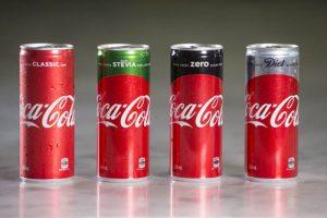
The new design uses the iconic red disc to unify the different packaging formats and varieties of Coke, comprising Classic, Zero, Diet Coke and Coke with Stevia.
“The Red Disc, which has become synonymous with the brand, first appeared in the 1930s and became the inspiration behind the biggest redesign in Coke’s history,” Mr Sommerville said.
Marketing Director for Coca-Cola South Pacific Lisa Winn said that the new design and the global ‘One Brand’ strategy give more prominence to red, a colour synonymous with the iconic brand.
“Over the years, with the launch of Diet Coke and other varieties such as Coke Zero, we have drifted away from ‘Coca-Cola red’. We realised we were in danger of losing our iconic colour in a sea of other colours such as silver, black and green, and we knew we needed to reclaim it as an icon of our brand. That’s one of the primary ideas behind the new design and the global One Brand strategy,” she said.
Ms Winn added that the launch of the redesign reinforces Coca-Cola’s commitment to encouraging consumers choice, with the company set to spend as much on advertising Coke Classic as it does on its low and no sugar varieties.
“We believe one of the best ways we can support the growth of low and no sugar varieties of Coca-Cola is for them to sit under our iconic Coca-Cola red so that all our Coke products share the limelight,” she said.
The new design packaging will be available in all major and independent retailers from Monday.